2023 Viva Magenta
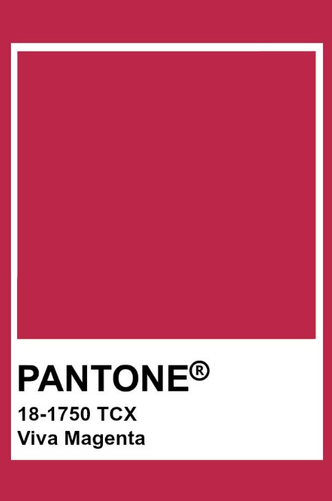
Pantone Color Institute has announced the color of the year 2023! The color of the year is Viva Magenta!
Pantone, which is accepted as the color authority of the world this year as every year, introduced the architectural color of 2023 as “Viva Magenta”.
 What is Pantone? Brief History of Pantone
We’ve all heard of Pantone. For those who do not know, let’s give brief information.
Pantone is a color standards brand accepted in more than 100 countries. It is a color system and supplier established to ensure correct color communication in many fields such as fashion, textile, paint, architecture, and graphic design.
It was established in 1950 in New York. Its founders are brothers Mervin and Jesse. Lawrence Herbert started working in the advertising department in 1956 and, with his chemistry knowledge, designed a system to utilize the company’s pigment stock in the production of color inks. He later bought the company’s shares and changed its name to ‘Pantone’.
The Pantone system has revolutionized the printing industry by preventing tonal differences in colors, keeping colors stable, and correcting color selection, and color consistency.
Pantone describes Viva Magenta, the color of the year, as a subtle crimson shade’.
The meaning of the color is stated as ‘an unusual hue for an unusual time’ and the impression it creates, at first sight, is said to be a ‘fist in a velvet glove.
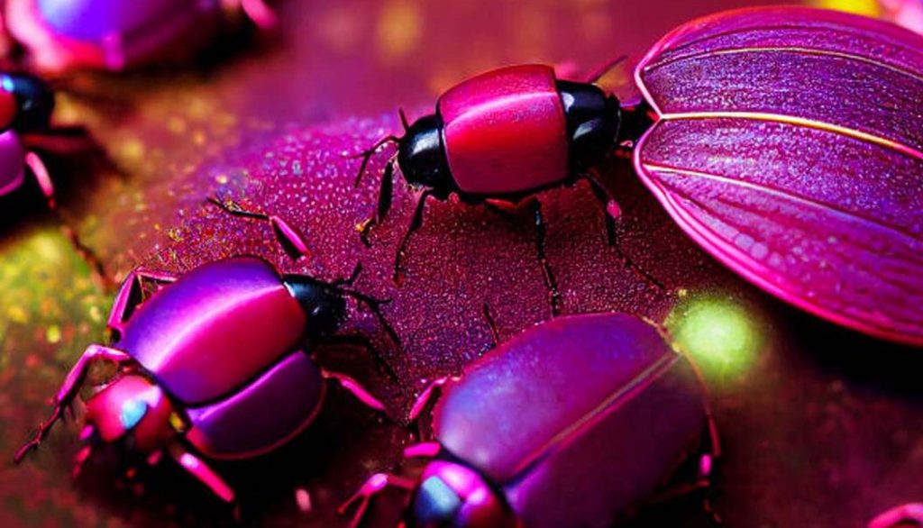
The inspiration for this color is a small insect called ‘Cochineal’.
Leatrice Eiseman, Director of the Pantone Color Institute, said, “This year’s color is powerful and empowering. Viva Magenta welcomes anyone with the same fervor and rebellious spirit for life. It’s a bold, humorous, and all-encompassing color. In this age of technology, we seek inspiration from nature and the real. “Viva Magenta comes from the red family and is one of the most valuable dyes belonging to the natural dye family. It is also inspired by cochineal red, one of the strongest and brightest dyes known in the world.” made the statement.

What is Pantone Code (PMS)?
Pantone Matching System (PMS) is Pantone’s color standards system. Each color in the Pantone catalog has its code. These codes are for example ‘PANTONE 12-5714 U ‘. Here, the letters U(Uncoated-Matte) and C( Coated-Glossy) at the end indicate whether the color is matte or glossy.
The most important feature of the prints you will receive with Pantone colors is that they provide more stable and even tones compared to CMYK printing. Apart from basic colors, it can transfer intermediate tones successfully and stably.
CMYK is a color model used in printing. C (Cyan-Blue), M (Magenta-Red), Y (Yellow-Yellow), and K denotes Key, that is, black.

Pantone Color Catalogs
1) Pantone Formula Guide | Coated & Uncoated
This catalog, which contains 1867 Pantone colors, is an extremely useful catalog that is an inspiration for graphics, fashion, and interiors and is highly preferred by designers.
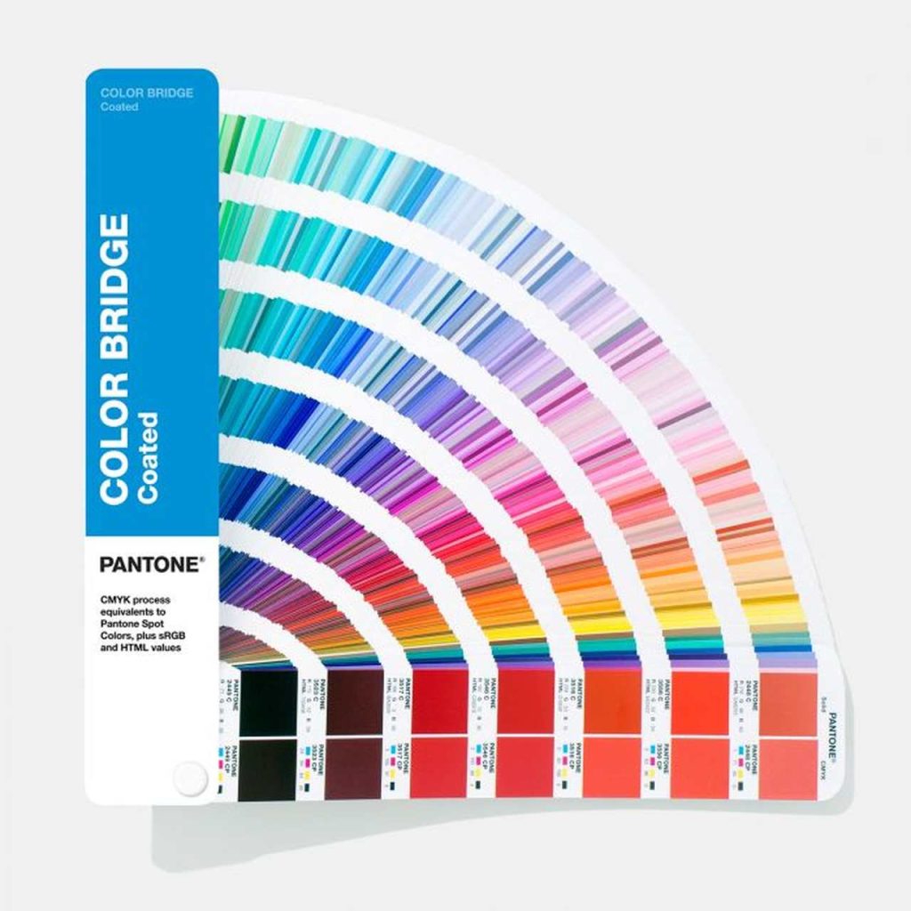
2) Pantone Color Bridge Guide Set | Coated & Uncoated
This catalog, which is more preferred by designers, includes coated and uncoated versions of CMYK color values and Pantone spot color values. In this way, it is also possible to check the color accuracy for printing.
3) Pantone Fashion, Home + Interiors Cotton Planner
This set by Pantone is again the product of choice for designers for textile, fashion, and interior designs.
4) PANTONE Metallics Coated
Another very useful catalog that offers 300 different metallic color combinations together, and also gives paint mixing ratios with detailed codes, as in other series.
Welcome to the MAGENTAVERSE.
With the help of Pantone, Huge collaboration, and the AI design tool Mid journey, they created an impressive visual universe dominated by Viva Magenta. In collaboration with the experiential art firm ARTECHOUSE, this universe was moved to the metaverse under the name “Magentaverse”.
Via: Int.Arch. Sevcan KELES
Bir yanıt yazın